My approach to designing a logo for an individual or business is a personalized process that begins with identifying the feelings or images that a client wants the logo to evoke in association with their business. Next comes a step-by-step process of conceptualizing, sketching, adjusting and creating an artistic and strongly visual final design, all done in close consultation with the client. This blog post is an account of my recent work developing a logo for Ishka Films, describing the journey from the client’s initial vision to a finished logo.
THE APPROACH
Last January I received an email from an Irish Filmmaker by the name of Mia Mullarkey. Mia had seen reproductions of my etchings “Octopus vulgaris’ and ‘Agonis avialae’ in the Moth Magazine, an Irish publication devoted to contemporary art and literature. Her email proposed that I create an image that somehow represented her film company, Ishka Films. Mia was looking for a logo that matched the feeling of her emerging company and that somehow suited the films she had already created.
In February Mia and I began corresponding about what she was looking for both stylistically and in terms of content. In an early email Mia shared with me a description that Ingmar Bergman, the Swedish film writer and director, wrote in reflecting on his own work and specifically in attempting to reveal the soul of his characters:
“...When I was a child, I imagined the soul to be a dragon, a shadow floating in the air like blue smoke—a huge winged creature, half bird, half fish. But inside the dragon, everything was red.”
Mia wrote that she had been gripped by this description and had been waiting for visual representation of this image that would work as a brand for her company.
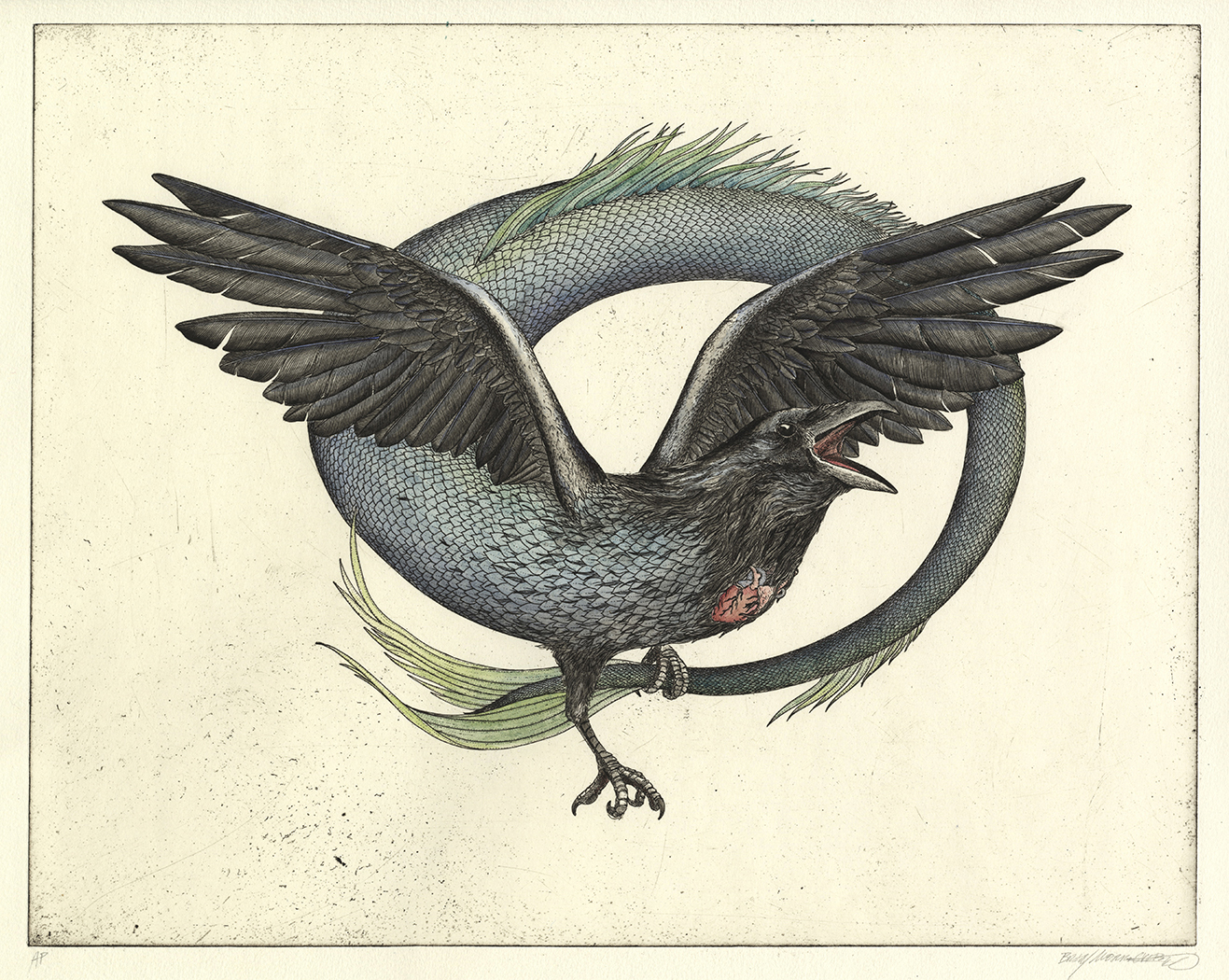
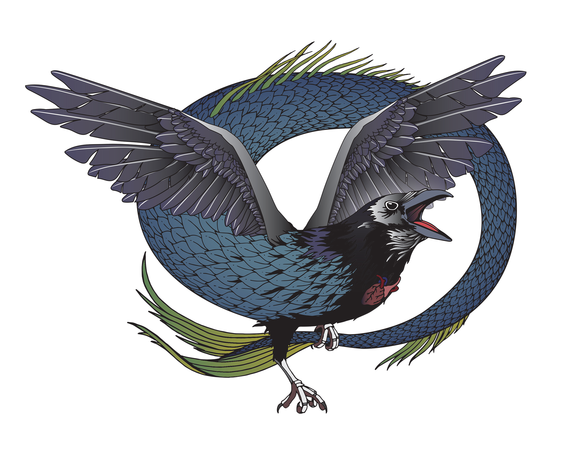
Through our correspondence Mia and I also came to the conclusion that this would be a two-part project. The first part of the project would be for me to create an etching that was half bird/half fish. The second part of the project would be to take the etching, simplify it and finally create a vector image (digital image) that would more appropriately work as a logo for Ishka films. In creating a vector graphic an image is not only simplified but also becomes easier to use in a wider range of applications and has the ability to be enlarged or shrunk without losing definition or clarity. This would be the image she would eventually use in a film following closing credits, on posters and online.
SKETCHING
In creating a commission or a logo for a person or company, a flow is inevitably developed between artist and client. After a contract is written and logistics are established I start logo/commission projects with a few initial sketches to get the ball rolling. The client will then write me a few notes and suggestions for changes. The call and response usually takes two or three rounds of sketches before my drawings zero in on what the client imagines for their piece or logo. The main difficulty of this process often comes in deciphering what a client is imagining. Sometimes it feels like looking for a needle in the haystack: finding the few core visual pieces that come across in a verbal description of what someone wants. Mia made this process easier by building a Pinterest Page filled with reference images of fish and birds and visual styles, and making clear and descriptive suggestions on how to adjust my sketches.
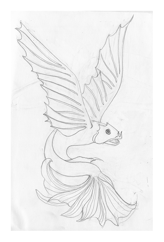
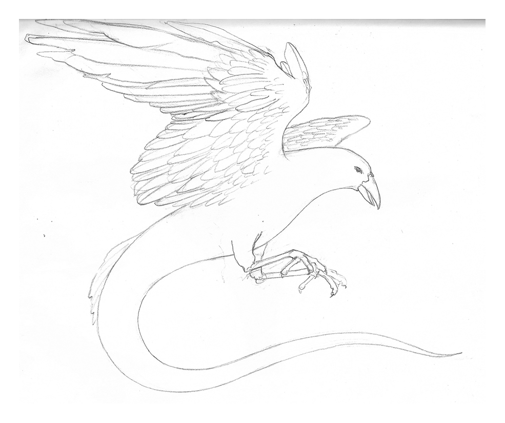
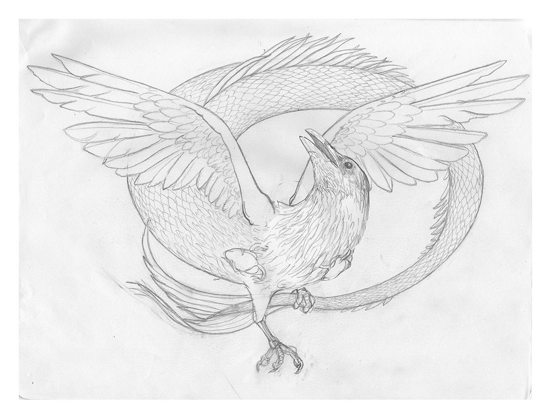
After completing 6 initial sketches based on Ingmar Bergman’s dragon and Mia’s annotations, Mia wrote back with notes about direction, size and proportion as well as comments on what parts of different sketches to keep, what parts to merge and what parts to leave out altogether. In an email Mia spoke directly about a specific sketch: “My main concern is the width of the torso where it goes from bird to fish, it feels a little too wide. Otherwise I think the ratio of wings to body to head is all great.”
From this initial round of sketches I created four more sketches based on her notes and added a heart (“like the soul is exposed”, wrote Mia) and changed the spread of wings and thrust of the body. Based on her notes about these new sketches, I created 4 final sketches that displayed the dragon with its bird head in various positions. Mia chose one and I was ready to begin the etching. (to see a video of the stages of an etching visit my YouTube video on creating the images for Wicked Bugs)
THE ETCHING - BOLD and FINE LINE TECHNIQUE
For a few years ago I adopted the technique of of multi-stage etching a technique used by one of my favorite botanical artists, Bobbi Angell. In generic terms, this process allows me to create an image with both bold lines and fine lines drawn closely together. In technical terms, this means that I can create an initial etching of the outlines of my image and etch it deeply by leaving it in the acid longer. I can then follow this with a second etching of the finer or lighter-etched details of the image. The result is an image with line variation that can be tightly packed together. Although this means the plate goes in the acid two (or more) times, it allows a greater range of linework without a lot of fussing around with Stop-out.
In the above images you can see the initial drawing of bold outlines. After drawing the whole image, I etched the plate for over an hour. I then reground the plate.
In this image you can see the darker, outline images as a dark line and the lighter drawn images as a copper color.
When I completed the etching I printed a few copies - some to keep as black and white images and another two for hand-tinting.
THE LOGO
A major challenge in creating a good logo is being able to shed the focus on detail and create a basic image that will work as a logo. After creating Mia’s logo I realized that I had created a relationship to the image that had been built on the rendering of fine detail. To move to a more basic image, I had to remove layer after layer of detail. In some ways moving back to rudimentary shapes was made more difficult by this complex relationship to line that I had developed in making the dragon as an etching.
After sending three different versions of the digital image to Mia we were eventually able to zero in on what she was looking for. This was accomplished, in part, by Mia sending me examples of other logos that she felt did the job in the way she wanted it done. She sent me three examples of simple black and white logos that were bold and simple enough to be read from far away but unique enough in shape and design to be experienced as recognizable brand.
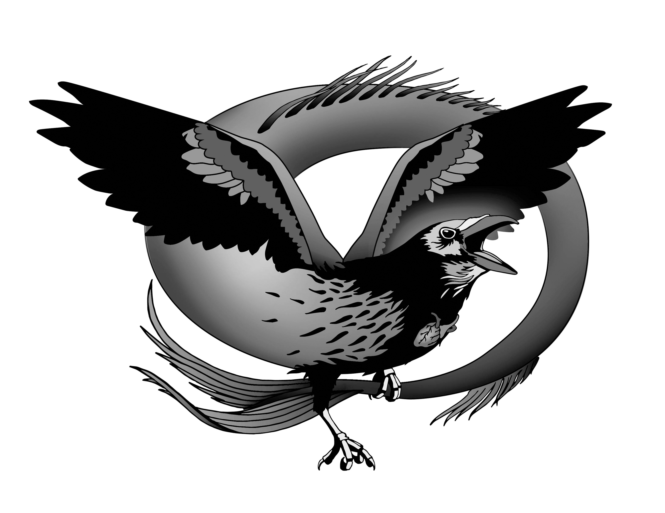
The images above show two different, earlier versions of the logo.
THE FINAL IMAGE
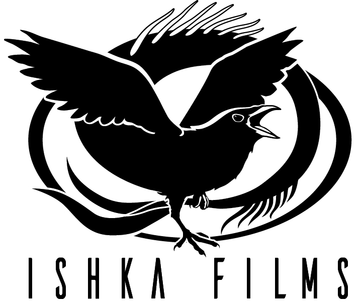
Eventually we landed on four different versions of the logo. The first two images are designed to be used as a stamp on the final credits of a film and the last two images are designed to be small logos used on posters and printed materials.
Make sure to check out the Ishka Films website to see Mia's latest creations.
If you are interested in having me create a logo for your new or existing company please don't hesitate to send me a message through my Contact page.
